Candidate number: 7212 Centre number: 16607
Tuesday, January 25, 2022
Monday, January 24, 2022
Final Website
Website Link- https://15-mhum.wixsite.com/expose
When the reader first opens the website, they are immediately greeted by a pop-up asking them to subscribe to the magazine's newsletter.
The rotating gallery of social media submissions with a call to action encourages the audience to become active for a chance of being in the next edition. Social media links are ever-present along the right hand side encouraging audience interaction.
Wednesday, December 1, 2021
Statement of Intent
How do you intend to use the four areas of the media theoretical framework to communicate to communicate meaning and meet the requirements of your chosen brief?
Product 1- Magazine
I intend to create a magazine which follows the genre conventions of real-life magazines but with a more sophisticated and aesthetically pleasing composition which would appeal to my 16-25 year old target audience. My masthead will be titled 'Exposé' which connotes that these stories are real- which would make my audience more emotionally engaged. My aim is to make the magazine look simple yet sophisticated with a direct mode of address that leans into informal, but not at the expense of sounding too colloquial. I will use my colour pallet to create a sense of brand identity and also to subvert the conventions of this genre as they will not be gaudy primary colours. The front cover will have a high image to text ratio to highlight the importance of the main story. This entices the target demographic to purchase the magazine as the visual elements appeal to the readership, together with the colour palette which will connote youth. By analysing real-life magazines in my research I have discovered that they often use sell lines which reflect their genre, I will attempt to replicate this in my own magazine.
Product 2- Website
The website for my magazine will provide extra content in the form of articles. I will continue to use the original house style of the magazine as well as a consistent logo for Bauer media, thus reflecting cross-platform digital convergence. The layout will be similar to that of the magazine to create a source of brand identity and will create a user friendly platform that will be easy to navigate. To specifically target my demographic I will use multiple technology features and audiovisual elements on the magazine, as well as social media links and hyperlinks for a source of audience interaction, this refers to Clay Shirky's audience theory as audience behaviour has changed due to the internet and the ability for the audience to create their own content. This will be reflected in a Q&A section with one of the subjects from the print front cover. The 'audience' will have submitted questions via Twitter which will then be answered in the form of a YouTube video for the magazine's channel.
Monday, November 8, 2021
Friday, September 10, 2021
Tasks to accomplish by October
- Learn how to use Photoshop
- Make mock-ups of my two front covers
- Create a contents page for the print edition
- Start the website
- 30 second audio-visual element in the form of an interview
- Potentially take more photos
Wednesday, September 8, 2021
Photoshoot No.2 *Unedited*
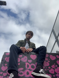
For my second photoshoot, I visited Brick Lane in London as the graffiti would make great urban backdrop. It began a bit more rocky as my model had to warm up to the camera and the idea of posing.
The following images are my favourite and the ones I will most likely use for a front cover after editing with Photoshop. Although, I like the dynamism of the above pictures and will probably use them on my website.
I think this was my most successful photoshoot in the way that it anchors the narrative of my intended magazine story. As stated in my previous post, next I will enhance my favourites on Photoshop.
Photoshoot No.1 *Unedited*
I was quite happy with the results of this photoshoot as they are aesthetically pleasing as my Statement of Intent indicated.
However, my story idea of an Instagram model being stalked isn't really anchored in the photos. As such I will still use these images but I will come up with a new story to fit them more accurately.
My next task will be to edit them on Photoshop.


